Marketing teams, agencies, and business leaders are generating more data than at any point in history. Every ad click, keyword position, user session, and conversion adds another layer to the growing pile of analytics. But the problem is? Most people don’t have time to interpret raw numbers.
That’s why data visualization has become a non-negotiable skill for modern marketers. When complex datasets are transformed into clear, intuitive charts, graphs, and visual stories, decision-making becomes faster, more accurate, and far more actionable.
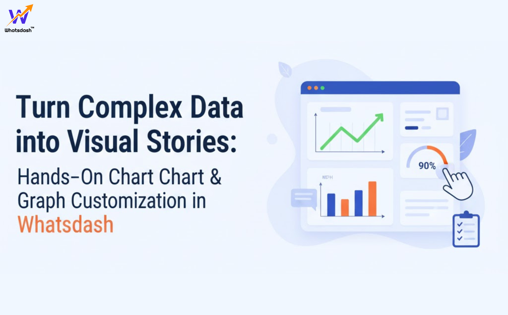
Today’s dashboards—like the one offered by Whatsdash—are no longer just data containers. They have evolved into customizable storytelling engines, allowing users to build visual narratives that explain what’s happening and why.
This article breaks down how hands-on chart and graph customization works, why it matters, which features to look for, and how teams can use visual storytelling to unlock better outcomes.
The Importance of Transforming Data into Visual Stories
Not all stakeholders speak the same language. Some understand tables. Some prefer charts. Some want quick summaries. Others need deep analysis.
So, converting data into visual stories helps bridge communication gaps across teams—marketing, sales, product, finance, and client stakeholders.
Why visual storytelling matters:
- Helps teams understand performance faster
- Reduces misinterpretation of complex metrics
- Highlights trends, anomalies, and correlations
- Improves client communication for agencies
- Enables better forecasting and strategy alignment
- Makes analytics accessible for non-technical viewers
A well-designed chart can often explain what 500 rows of raw data cannot. Visual storytelling is not just about aesthetics—it’s about clarity and influence.
The Shift from Static Charts to Customizable Dashboards
For years, marketers relied on basic bar charts, pie charts, and line graphs exported from spreadsheets. These visuals were often:
- Hard to update
- Disconnected from real-time data
- Bland and generic
- Inconsistent across reports
- Unable to represent multi-source insights
Today, the landscape has changed.
Dashboards now offer dynamic, configurable chart builders that allow marketers to:
- Customize colors
- Choose from advanced chart types
- Build multi-metric comparisons
- Map custom KPIs
- Layer additional datasets
- Add annotations and notes
- Adjust visualization styles to match brand or preference
This evolution has made data storytelling not only more powerful—but also significantly more efficient.
Hands-On Chart & Graph Customization: What It Means Today
Modern reporting dashboards give users full creative control over how data is presented. Like an automated reporting tool that provides advanced reporting solutions. Here’s what hands-on customization typically includes:
1. Choose from Multiple Chart Types
Beyond simple line and bar charts, advanced dashboards include:
- Area charts
- Heatmaps
- Performance funnels
- Multi-series line charts
- Scatter plots
- KPI cards
- Trend analysis charts
- Conversion path visuals
Choosing the right format is the first step toward clarity.
2. Configure Data Sources & Metrics
Users can select:
- Channels (SEO, PPC, Social, Email, etc.)
- Timeframes (daily, weekly, quarterly)
- Segments (device, gender, location, platform)
- Metrics and dimensions
This ensures each chart is built with context and purpose.
3. Customize Visual Styles
Most dashboards allow personalization of:
- Colors
- Shapes
- Gridlines
- Data labels
- Chart thickness
- Font styles
- Axis formatting
This creates consistency across all visualizations.
4. Combine Multiple Metrics in One Visualization
Great for identifying relationships between performance indicators.
Examples:
- Impressions + Clicks
- Spend + Conversions
- Traffic + Keyword Rankings
- Leads + Revenue
These comparisons help uncover patterns that single-metric charts miss.
5. Add Notes, Labels & Insights
Annotations make charts more meaningful.
A simple label such as:
- “New campaign launched here”
- “Algorithm update occurred on this date”
- “Budget increase started here”
These helps contextualize performance.
6. Interactive Charts
Users can hover over specific points to reveal additional data layers.
This improves engagement and makes charts more informative.
7. Save & Reuse Custom Templates
Once a team finalizes a chart style, it can be saved and reused across:
- Monthly reports
- Client dashboards
- Internal presentations
Consistency is key to clear communication.
Why Customization Matters for Marketing Teams
Regardless of whether you’re a small business or a global agency, you need more than generic visuals. Customization empowers teams to control how information is presented and interpreted. So, a customizable reporting system is something that really works well. Like the privilege is you can edit your report according to your choice.
Here’s why it matters:
✔ Better Decision-Making
Custom charts allow teams to see the metrics that matter most—organized in a way that matches strategic priorities.
✔ Better Client Transparency
Agencies can personalize charts to highlight:
- Wins
- Performance progress
- ROI
- Optimization decisions
This builds trust.
✔ Consistent Reporting
Custom chart templates eliminate confusion by ensuring everyone sees the data in the same format.
✔ Faster Team Alignment
When charts are built with intention, discussions shift from “what are these numbers?” to “what’s our next move?”
Key Features to Look for in a Chart & Graph Customization Tool
If you’re evaluating a modern dashboard solution, these are the features that matter most:
1. Drag-and-Drop Builder
Allows users to assemble charts without technical skills.
2. Multi-Source Data Integration
Real-time connection to:
- Google Ads
- GA4
- YouTube
- Email platforms
- SEO tools
- CRM platforms
3. Advanced Chart Library
A diverse selection of graph types enhances storytelling options.
4. Cross-Metric Comparison Tools
Helps create more insightful analysis.
5. Preset Templates & Themes
Fast set-up for recurring reporting needs.
6. Annotations & Event Tracking
Performance becomes meaningful when supported by context.
7. Shareable Dashboards
Make it easy to share visual stories with stakeholders.
8. Export Options
Charts should be exportable as:
- PNG
- Report pages
- Live dashboard links
These features empower teams to create visual stories that people actually understand.
How Modern Dashboards Like Whatsdash Support Visual Storytelling
Platforms like Whatsdash are designed for marketers who want both control and efficiency. With customizable charts, drag-and-drop layouts, and multi-metric comparisons, users can turn complex datasets into powerful narratives without requiring design or technical expertise.
Its ability to combine multiple data sources into customizable visual stories makes it especially useful for agencies and marketing teams managing fast-changing campaigns.
Best Use Cases: Where Custom Charts Make the Biggest Impact
Custom chart and graph functionality isn’t just for monthly reporting. It can be used across dozens of real business scenarios.
1. Agency Reporting
Agencies can create:
- Campaign-specific visualizations
- Multi-channel performance comparisons
- Funnel breakdowns
- ROI insights
Custom charts help agencies reduce back-and-forth with clients.
2. In-House Marketing Teams
Teams can visualize:
- Lead quality
- Content performance
- SEO growth trends
- Ad efficiency
- Customer journey patterns
This improves team collaboration and data-driven decision-making.
3. Performance Marketing & PPC Teams
Custom charts help map:
- CPC trends
- ROAS comparisons
- Budget pacing
- Creative-level insights
Visualization helps quickly optimize campaigns.
4. Small Business Owners
Customized visuals help translate complex data into clear action steps—without analytics expertise.
5. Executives & Decision Makers
Executives need high-level views.
Custom dashboards simplify:
- Board reporting
- Revenue forecasting
- Channel contribution analysis
This eliminates hours spent deciphering raw numbers.
Why Chart Customization Is Useful for Companies & Agencies
✔ Clearer Storytelling for Stakeholders
Custom visuals help explain what’s happening—and why it matters.
✔ More Confidence in Decision-Making
When the data is clear, actions become clearer.
✔ Reduced Reporting Time
Templates and pre-built charts speed up reporting cycles.
✔ Improved ROI Insights
Visual patterns help teams identify what’s working and where to optimize.
✔ Easier Collaboration Across Departments
Everyone uses a shared visual language.
Conclusion
Turning data into visual stories isn’t a luxury—it’s a necessity. Customizable charts and graphs are the bridge between raw analytics and meaningful insights. They help teams move faster, align more easily, and communicate performance with clarity.
Modern dashboards—like Whatsdash—support storytellers by giving marketers hands-on control over how their data looks, behaves, and communicates value.
If your team wants to make smarter decisions, win more clients, or communicate insights with confidence, start by improving the way you visualize your data.