Custom Widget
The Custom Widget feature provides complete control and maximum flexibility, allowing users to build precise data visualizations tailored exactly to their unique reporting requirements.
This feature is beneficial when the Preset Widgets do not offer the specific combination of metrics, dimensions, or visualization types needed for your analysis.
What are Custom Widgets?
Custom Widgets are blank canvases where the user manually defines every component of the visualization, ensuring the resulting chart or metric perfectly aligns with the analytical requirements.
-
Total Accessibility: Users select the data source, visualization types, the specific metrics (what to measure), and the dimensions (how to group or slice the data).
-
Deep Dive Analysis: Ideal for complex segmentation, cross-referencing multiple metrics, or applying custom calculations that go beyond standard reporting.
How Custom Widgets Work
The custom widget workflow guides the user through a selection process, starting with the visualization type and culminating in the data selection ,to ensure the widget is built correctly for the data it contains.

Here is the step-by-step process for creating a Custom Widget:
Start Building (Edit Mode Activation):
1.Once the dashboard is created from the Dashboard Page, you will automatically land in the blank dashboard in Edit Mode.
2.For adding widgets, you can choose from Preset Widget, Custom Widget, Static Widget, and Custom Metrics Widgets from the right side of the screen.
3.In Edit Mode, click the 'Custom Widget' option.

Choose Visualization Type:
1.A list of available visualization types is displayed, including:
-
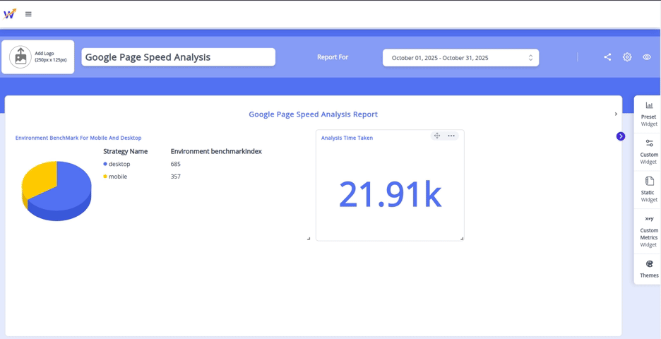
Gauge: For measuring progress against a goal.
-
List/Table: For viewing raw, segmented data.
-
Number: For displaying a single, high-impact KPI.
-
Trend/History: For tracking performance changes over time.
-
Pie: For viewing proportional segment data.
2.Select the type that is best applicable for the data representation.
Define Metrics and Dimensions:
1.Based on the selected visualization type and your connected data sources, you will then be prompted to:
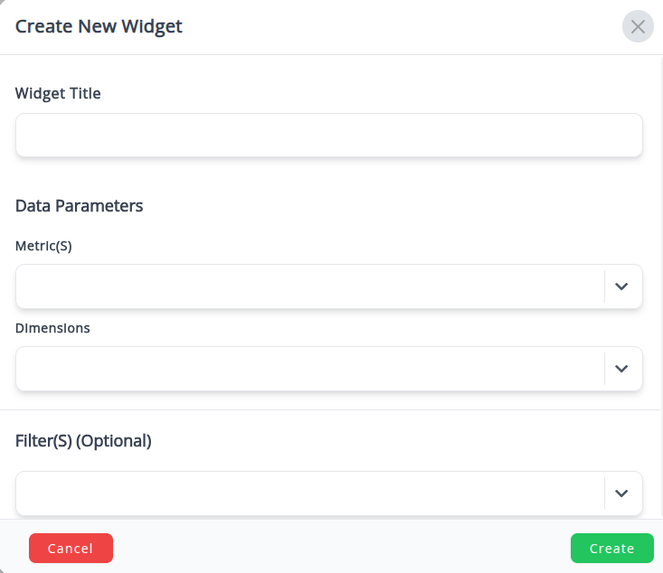
- Select Metrics : Choose the specific numerical values you want to aggregate.
- Select Dimensions : Choose how you want to break down those metrics (if applicable).
2.On selecting the metrics and dimensions, the widget is immediately created with data based on your selection
Post-Creation Flexibility
1.After widget creation, you can explicitly and dynamically change the metrics, dimensions, and visualization type as often as required.
2.You can easily drag and drop the widget to reposition it within the dashboard layout to optimize viewing flow.